
5 Paint Colours We’re Loving Right Now
There’s no quicker way to transform a room than with the right paint colour. Whether it’s creating contrast, adding warmth, or setting the tone for the entire home, paint has the power to completely shift how a space feels. As designers, we’re constantly experimenting with colour, but a few tried-and-true shades continue to rise to the top.
Here are 5 Benjamin Moore paint colours we’re currently loving, and how we love to use them.
1. Chantilly Lace OC-65
Clean, crisp, and ultra-refined. Chantilly Lace is our go-to white when we want a space to feel fresh and modern. With no visible undertones, it reflects light beautifully and serves as a perfect backdrop for layered textures, warm woods, and striking accents.
Where we use it: Trim, ceilings, cabinetry, or walls in modern spaces where clarity and brightness are key.
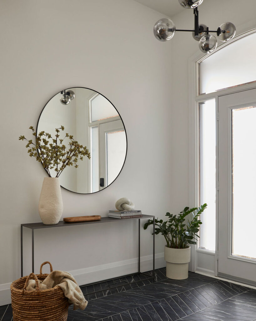
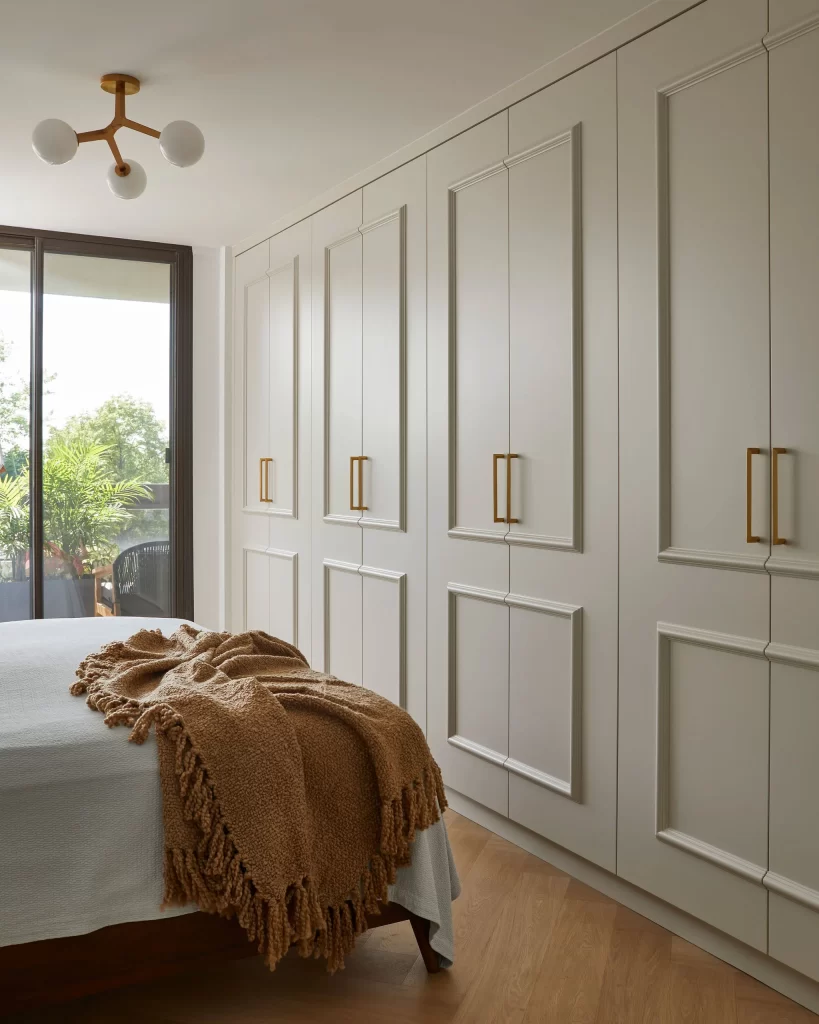
2. Pale Oak OC-20
Pale Oak sits perfectly between off-white and soft taupe, giving it incredible versatility. It feels warm without being too beige, and neutral without falling flat. This shade adapts beautifully to different lighting and brings a subtle sense of calm to any room.
Where we use it: Living rooms, bedrooms, and transitional spaces that benefit from a soft, layered palette.
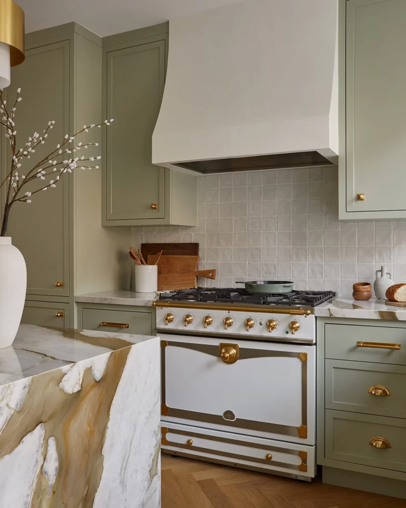
3. October Mist CC-550
A muted sage green with a quiet, organic quality, October Mist adds just enough colour to feel intentional, without overwhelming the space. It’s earthy and soft, making it an ideal choice for relaxed, natural interiors.
Where we use it: Kitchens, bathrooms, guest bedrooms, or anywhere you want a hint of colour that still reads neutral.
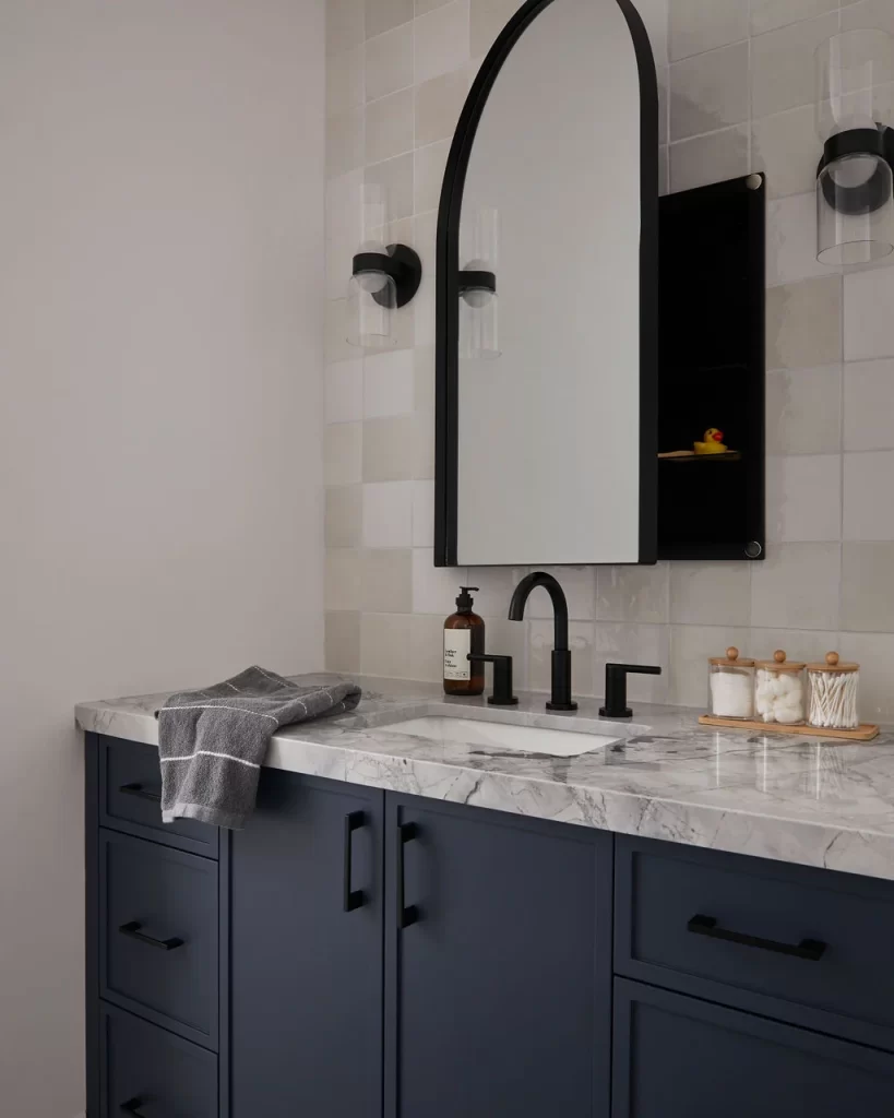
4. Hale Navy HC-154
Hale Navy is a true classic. Rich, deep, and endlessly versatile. It brings instant sophistication and pairs well with both crisp whites and warm metallics. It’s bold, but never trendy.
Where we use it: Kitchen islands, millwork, powder rooms, or as an accent in otherwise light and neutral spaces.
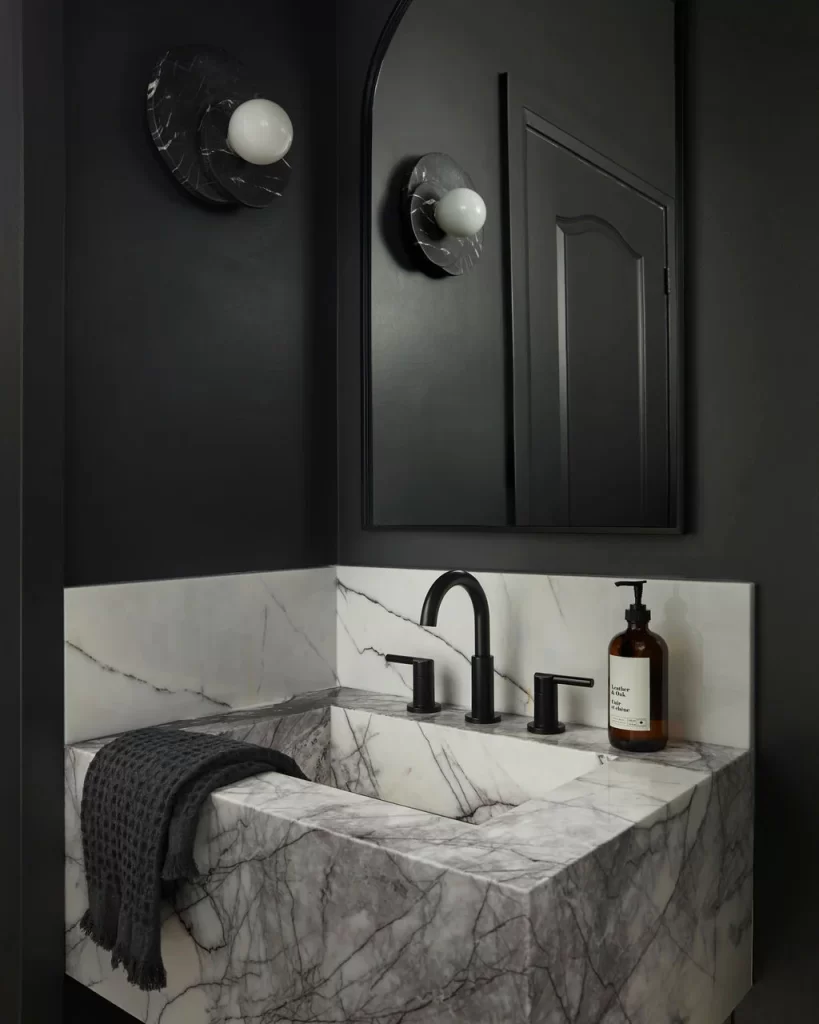
5. Wrought Iron 2124-10
Moody and dramatic, Wrought Iron is a near-black that adds contrast without feeling harsh. It’s softer than a true black, with a touch of warmth that makes it feel grounded and elevated all at once.
Where we use it: Powder rooms, accent walls, built-ins, or anywhere you want depth and drama.
Final Thoughts
The right paint colour is about more than just aesthetics, it sets the tone for how a space feels and functions. Whether you’re drawn to light and airy whites or bold, grounding shades, these five Benjamin Moore colours are standing out in our current work for their versatility, elegance, and timeless appeal.
Need help designing a space that’s not just beautiful, but truly you?
Contact us